In today’s digital landscape, most users access websites through mobile devices. A responsive website is no longer optional. It has become a standard requirement for businesses that want to compete online.
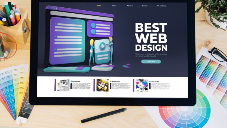
Many companies invest in a website but overlook mobile experience. This leads to poor usability and lost customers within the first few seconds. A strong website design is not just about layout. It directly impacts SEO performance, user experience, and conversion rates.
This article helps you understand responsive design and how to apply it effectively.
1. What Is a Responsive Website?
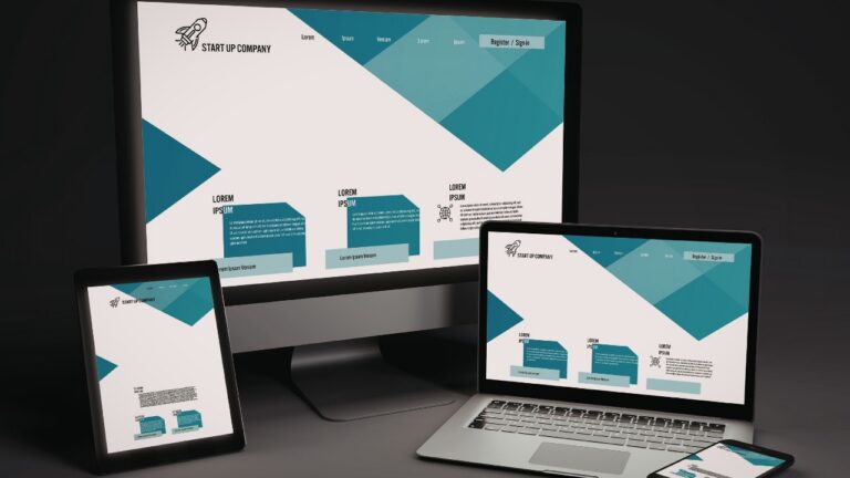
A responsive website is designed to automatically adapt its layout across different screen sizes. This includes mobile phones, tablets, and desktop devices. Responsive design allows all elements, including images, text, and layout, to adjust dynamically. This ensures that content remains clear and easy to navigate on any device.
Instead of building multiple versions of a website, businesses can use a single responsive website design system. From an SEO perspective, a responsive website helps search engines crawl and understand content more effectively.

2. Why Responsive Design Matters for SEO
Responsive website design plays a critical role in how search engines evaluate your site. Google uses mobile-first indexing, meaning the mobile version of your website is prioritized. If your website is not responsive, mobile users may experience broken layouts or unreadable content. A responsive SEO website ensures consistent content across devices. This helps search engines interpret your content accurately.
Another important benefit is having a single URL structure. This consolidates SEO signals such as backlinks and ranking authority. Performance is also a key factor. Core Web Vitals measure loading speed, visual stability, and interaction. Businesses can analyze performance using Google PageSpeed Insights to evaluate both mobile and desktop versions.
3. How Responsive Design Improves User Experience
SEO brings users to your website, but responsive design keeps them there. User experience plays a major role in engagement and conversion. Mobile users behave differently from desktop users. They scan content quickly and expect fast interactions.
A responsive website ensures content fits the screen without requiring zoom or horizontal scrolling. This improves readability and usability. Buttons and navigation are optimized for touch interaction, making it easier for users to explore your website.
Better user experience leads to longer session duration and lower bounce rate. These factors indirectly support SEO performance.
4. Key Elements of Responsive Design
Responsive design requires a comprehensive approach, not just flexible layouts.
4.1 Flexible Layout System
Layouts should be built using fluid grids that adapt to different screen sizes. Important content should appear early, especially on mobile.

4.2 Optimized Images and Media
Images must scale properly and use optimized formats. This improves loading speed and overall performance.
4.3 Readable Typography
Text should be easy to read on small screens. Proper font size and spacing are essential for mobile usability.
4.4 Simple Navigation
Navigation must be intuitive and easy to use. Users should find information quickly without confusion.
5. Responsive Website vs Mobile-First Design
Responsive and mobile-first design are distinct yet interconnected concepts. By focusing on layout adaptation across all devices, responsive design guarantees a seamless visual experience for every user, no matter the screen dimensions.
Mobile-first design prioritizes building the mobile experience first. It then expands to larger screens. A responsive website does not always follow mobile-first principles. Many websites only resize layout without optimizing content.
For best results, businesses should combine responsive design with mobile-first thinking.
6. Common Mistakes in Responsive Website Design
Many businesses misunderstand responsive design. They assume flexible layout alone is enough. Responsive design requires both technical execution and content strategy.
- One common mistake is shrinking desktop layout for mobile. This creates cluttered and hard-to-read content.
- Another issue is not optimizing images and resources. Large files slow down the website and hurt performance.
- Complex navigation is also a problem. Multi-level menus are difficult to use on small screens.
- Testing is often overlooked. Websites should be tested across multiple devices to ensure consistency.
7. How Responsive Website Design Affects Cost
Service costs for website design typically cover fluid grid development, flexible image scaling, and extensive cross-device testing. A responsive website may require higher upfront investment. However, it delivers better long-term value. Businesses only need to manage one responsive website instead of multiple versions. This reduces maintenance costs. It also improves SEO efficiency by consolidating ranking signals into a single URL. Opportunity cost is significant. A non-responsive website can lose customers instantly, especially on mobile.
Building responsive design from the beginning helps avoid expensive redesign later.
8. Website Solutions by KMT Solutions
At KMT Solutions, our website design services are part of a broader digital growth strategy. We do not build websites just to function. We build them to perform.
Our approach integrates responsive design from the planning stage. This ensures optimal performance across devices. We focus on structure, content, SEO, and conversion. This creates a strong foundation for long-term business growth.
With KMT Solutions, your website is not just visually appealing. It becomes a tool to generate real customers.